Our choice of typography is purposeful as it is a close representation of graffiti art. This reinforces the influence youth culture has had on our film and ideas. We decided to keep the font white and pure as the lack of colour allows the reader to create their own connotations. This also ensures that the title stands out against the plain black background.
Monday, 26 March 2012
The Title Of Our Film - Laura Bebber
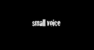
After much deliberation, we decided upon the title 'small voice'. We felt that this was effective as it is a true reflection of how the central protagonist is feeling during the film. Her feelings are merely 'unheard' to others and the use of the word 'small' emphasises her status and value in society.
Our choice of typography is purposeful as it is a close representation of graffiti art. This reinforces the influence youth culture has had on our film and ideas. We decided to keep the font white and pure as the lack of colour allows the reader to create their own connotations. This also ensures that the title stands out against the plain black background.
Our choice of typography is purposeful as it is a close representation of graffiti art. This reinforces the influence youth culture has had on our film and ideas. We decided to keep the font white and pure as the lack of colour allows the reader to create their own connotations. This also ensures that the title stands out against the plain black background.
Subscribe to:
Post Comments (Atom)

No comments:
Post a Comment