G321 Foundation Portfolio - Film
Friday, 4 May 2012
Monday, 2 April 2012
Evaluation - Question 7
Evaluation Question 7
In the progression from the Preliminary Task to the full product we have learned:
- Working outdoors, with natural light opposed to prosthetic light made the colouring of the clips harder as it meant we had to adjust each and every clip depending on different levels of lighting.
- The difficulty of shooting match-on-action shots on location. Here we have two match-on-action shots from the task, difference being the time taken between shots and distance travelled to film each shot Here in the preliminary task it took us a matter of seconds to relocate the camera and get the angle we wanted. Whereas in the final product below, the time taken to relocate the camera for a different angle and shot took much longer.
Overall the greatest thing we believe we have learnt is that time management is very important to creating a successful product. We also found that the process of filming and editing takes considerably longer than, we may first have, anticipated.
Sunday, 1 April 2012
Evaluation - Question 5
In relation to the playability of our product, we believe that is attracts and addresses our target audience in a number of ways.
Firstly, our product is centred around teenage ways of life, and explores the taboo subject of teenage suicide. This would draw in our audience because this subject matter is often potrayed in the media as a teenage trait, and many young people would relate to how our female protagonist is feeling.
The gender or our target audience is female, and to rienforce this we made sure that the first character you see is a girl, that fits the criteria of being vulnerable, depressed and in love. By shooting a couple of college scenes, it also rienforces the idea that our target audience are students, that are well educated and perhaps in the middle class social status bracket. Furthermore, the male protagonist voice over is distinctively a British accent, which also emphasises the more educated side to teenage life, and how our film represents real characters with real emotion.
In many coming of age films, and teenage films in general there is a stereotypical 'cool guy' male that girls have a crush on. We have made Alex (the male protagonist) to fit that stereotype, and has two females that want him throughout the film. This would draw in female attraction as we try to make the viewers want him to be with the female protagonist, and leave behind his 'cool' group that bully her.
We believe that our media product also has an educational aspect to it, and that it could teach young people about morals and anti-bullying. This would attract a younger audience that are on a learning curve, and are perhaps stuck in the same situation through school/college.
The feedback from peers we recieved indicated that they felt that our opening sequence attracted their attention, and that they wanted to watch the full film! I think we have succesfully addressed our target audience, and that all of our research and understanding about how we are going to address them definitely paid off.
Saturday, 31 March 2012
Evaluation - Question 4
After doing some research into audiences and demographic profiles, we decided that the target audience for our product would be of the younger variety, more specifically in their teenage years. Being in this age category ourselves, this proved to be a straight forward task, as we were creating material that would potentially be viewed by ourselves.
In the early stages of our project, we did a section on the blog that shows the ideal demographic profile of a member of our target audience. This is what we came up with:
Age: 16-25
General interests: Being with friends, concerts, being with the boyfriend, engaging in many media products such as face book and twitter, reading books centred around romance/thrillers. Likes to be different and not follow a crowd.
Musical taste: Non mainstream, quirky style of rock/acoustic based music.
Movies likely to have seen: This is England, Fish Tank, Submarine, Angus Thongs and Perfect Snogging, Harry Potter franchise.
Relationship status: In a steady relationship, likely to take her boyfriend/partner along with her to see the movie.
Reasons for consumption: To explore certain ideas that they haven't experienced before, and to form on screen relationships with characters. They consume media in a light hearted way, for entertainment purposes and to be sociable, and up to date with media.
The genre of our media product is coming of age, romance and drama. The storyline involves a teenage boy discovering himself and the world around him, and falling in love with a girl who doesnt 'fit in' with the crowd. His goal is to stop her from ending her life come the end of the film. The interest of this kind of media product would be with teenagers that perhaps haven't found themselves yet, but just go along with a crowd to feel that they fit in.
In the early stages of our project, we did a section on the blog that shows the ideal demographic profile of a member of our target audience. This is what we came up with:
Age: 16-25
Gender: Female
Social status: Comes from a working class back round, aims to achieve highly through education and better own situation.
Ethnic back round: Mainly white, british, but may appeal to other ethnic groups.
Education: A full time student at college/university.
Subjects likely to be taking: Psychology, media, sociology, art. A mixture of academic and creative subjects.
Occupation: Part time work in a retail store.
Musical taste: Non mainstream, quirky style of rock/acoustic based music.
Movies likely to have seen: This is England, Fish Tank, Submarine, Angus Thongs and Perfect Snogging, Harry Potter franchise.
Relationship status: In a steady relationship, likely to take her boyfriend/partner along with her to see the movie.
Reasons for consumption: To explore certain ideas that they haven't experienced before, and to form on screen relationships with characters. They consume media in a light hearted way, for entertainment purposes and to be sociable, and up to date with media.
The genre of our media product is coming of age, romance and drama. The storyline involves a teenage boy discovering himself and the world around him, and falling in love with a girl who doesnt 'fit in' with the crowd. His goal is to stop her from ending her life come the end of the film. The interest of this kind of media product would be with teenagers that perhaps haven't found themselves yet, but just go along with a crowd to feel that they fit in.
Friday, 30 March 2012
Evaluation - Question 2
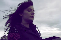
Our central protagonist, a typical teenage female, is victimised throughout the opening sequence by a group of individuals. This act alone proves her lowly respected status and position within their ‘popular’ society. Portraying a young female as the main character appears to be rather popular within this particular industry and enabled us to reinforce vulnerability upon her. We also emphasised isolation and independence within youth culture and explored various emotions.

Teenagers are the main focus of our media product. We hope that the main character will be an individual in which the target audience can relate to and construct emotion for. This particular female is defenceless, fragile and inferior which is in contrast to the general perception the public already have of teenagers. However, this prejudiced image is represented by the other characters that victimise and torment the vulnerable female lead. 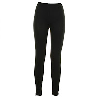
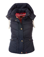
We decided that using costumes that reflect the average teenager; such as leggings, a jumper and ‘gilet’ would be more effective and realistic than designing specific outfits. All of the characters included in our footage are filmed wearing average, casual clothing in which they would on a daily basis. This concept also reinforces the realism of our media product and ensures that our target audience feels a close relation to the characters.
 ‘Fish Tank’ portrays the main character, Mia, in a completely different way to that of our film. This aggressive teenage girl has been thrown out of school and finds it difficult to engage in any sophisticated conversation. Her clothes are stereotypically ‘chavy’ and her language is extremely poor. The female in our film is vulnerable and reserved. She is repeatedly victimised and has the ability to win over the viewer’s hearts.
 Despite the clear differences between the two characters, they are both alienated from society and engage in threatening conflict with peers. Each of the protagonists show clear connections between their relationships and how their home-lives have affected them and display both physical and emotional aspects of growth. They portray two opposite stereotypes and help to reinforce absolute realism into each film.


 ‘Fish Tank’ portrays the main character, Mia, in a completely different way to that of our film. This aggressive teenage girl has been thrown out of school and finds it difficult to engage in any sophisticated conversation. Her clothes are stereotypically ‘chavy’ and her language is extremely poor. The female in our film is vulnerable and reserved. She is repeatedly victimised and has the ability to win over the viewer’s hearts.
  Despite the clear differences between the two characters, they are both alienated from society and engage in threatening conflict with peers. Each of the protagonists show clear connections between their relationships and how their home-lives have affected them and display both physical and emotional aspects of growth. They portray two opposite stereotypes and help to reinforce absolute realism into each film.
 Preliminary - Continuity Exercise By Laura Bebber And Alex Smith
This is the prelimiary sequence in which Alex and I created to show aspects of continuity and various shot types. I feel that the match-on-action flows extremely well and that we learnt a lot from the process. The shot-reverse-shots during the exchange of dialogue are effective and help to improve the overall professionalism.
In order to improve on the overall construction, I feel that we could have cropped the scene at 0:21 as you can hear laughing in the background. Despite this, the effort we put into the filming shows as we achieved good match on action fluency. We also incorporated plenty of dialogue and a brief story line into the task. We thought carefully about each small aspect such as which foot Alex was stepping onto to increase the validity. The editing went well as we filmed each stage in chronological order. This made the process easier and allowed us to finish the project within a short space of time.
Monday, 26 March 2012
The Title Of Our Film - Laura Bebber
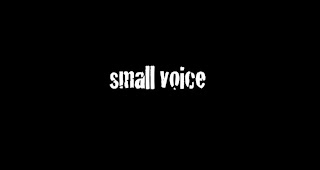
After much deliberation, we decided upon the title 'small voice'. We felt that this was effective as it is a true reflection of how the central protagonist is feeling during the film. Her feelings are merely 'unheard' to others and the use of the word 'small' emphasises her status and value in society.
Our choice of typography is purposeful as it is a close representation of graffiti art. This reinforces the influence youth culture has had on our film and ideas. We decided to keep the font white and pure as the lack of colour allows the reader to create their own connotations. This also ensures that the title stands out against the plain black background.
Our choice of typography is purposeful as it is a close representation of graffiti art. This reinforces the influence youth culture has had on our film and ideas. We decided to keep the font white and pure as the lack of colour allows the reader to create their own connotations. This also ensures that the title stands out against the plain black background.
Diary Entry For Editing - By Laura Bebber
DAY FIVE
Today we finished off our final product by incorporating titles into our opening. We chose the font specifically to reinforce our coming of age genre and to attract our target audience furthermore. We decided to ensure that the typography remained pure and simple by using the colour white. I feel that this was an effective idea as the titles stood out but did not distract from the footage behind. We also felt that the font slightly resembled graffiti art reinforcing the genre once again. After researching into other similar movies on the market, we discovered that they usually used the same technique. We then progressed to importing our company ident in which I previously constructed. This gave our film a polished finish.
Brief overview:
- Downloading specific typography from Dafont.com
- 'Adding text' ( film titles)
- Size
- Positioning
- Colour
- Importing video clip (company ident)
- Finalising opening sequence
Brief overview:
- Downloading specific typography from Dafont.com
- 'Adding text' ( film titles)
- Size
- Positioning
- Colour
- Importing video clip (company ident)
- Finalising opening sequence
Diary Entry For Editing - By Laura Bebber
DAY FOUR
During our lesson, we managed to successfully edit the majority of the film sequence. We added a slow motion effect to certain clips to create tension and a dramatic atmosphere. In order to maximise the overall quality of our footage, we sharpened the image and made various colour alterations. This proved rather tiresome as we had to alter every individual clip in the same way. However, I definitely feel that this gave our film a more glossy finish. We decided to edge towards the colour purple as it gave an effective atmosphere and felt that it was a good reinforcement of our desired genre. Today we also imported the original soundtrack and voice over into our project. This instantly improved the quality of our film and added an entirely more professional finish. We cleverly incorporated the audio to specifically match the footage on screen and altered the volume levels to ensure that both files were not overpowering one another. We played around with various audio effects and edited the pitch of the music for a more polished finish.
Brief overview:
- Changing speed (slow motion)
- Sharpening visuals
- Colour alterations
- Importing audio
- Incorporating music and voice over
- Volume levels
- Pitch
- Changing speed (slow motion)
- Sharpening visuals
- Colour alterations
- Importing audio
- Incorporating music and voice over
- Volume levels
- Pitch
Diary Entry For Editing - By Laura Bebber
DAY THREE
Brief overview:
- Cropping
- Cutting/deleting files
- Construction of entire opening
- Overlaying (fluency)
- Time management
- Altering motion (reverse)
Today we managed to roughly put together all of the clips needed for our finished product. We had a few issues with the timing as the length was beyond the maximum limit allowed for the course. During the lesson, we shortened some of the film clips and deleted any unnecessary footage. This proved difficult as our complicated story line was hard to portray in such a short space of time. Changing the clips into a reverse motion for the majority of the opening was challenging as we had to ensure each clip flowed correctly without looking amateur. However, after a lot of hard work, we were impressed with our outcome.
Brief overview:
- Cropping
- Cutting/deleting files
- Construction of entire opening
- Overlaying (fluency)
- Time management
- Altering motion (reverse)
Diary Entry For Editing - By Laura Bebber
DAY TWO
Today we continued structuring our footage and forming the opening of our sequence. By cropping, muting and changing the speed of the clips, our storyline began to take shape. We ensured that the match on action shots flowed well in order to create a more professional finish. During our Media Studies lesson today, we also managed to construct the middle of our sequence. We used our previously written treatment as a close guide on the construction and were very successful with this.
Brief overview:
- Cropping
- Speed alterations
- Muting background noise
- Match on action fluency
- General construction
- Guidance (treatment)
Brief overview:
- Cropping
- Speed alterations
- Muting background noise
- Match on action fluency
- General construction
- Guidance (treatment)
Subscribe to:
Comments (Atom)


